![]()
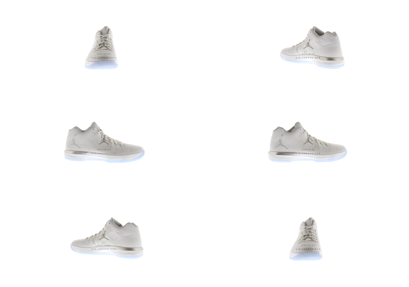
A preview of the unseen Air Jordan 31 Low before it is released in Spring/Summer of 2017
Source: 1ST LOOK – AJ XXXI LOW. air.jordan.com
air.jordan.com has delivered the first images of the samples of the 31 Low in these rotating gifs. I think the shoe in the monochrome white and silver is the best looking of the bunch. I don’t have data on how the 31 is performing overall, but this shoe is clean and looks more like a luxury Jordan Brand releases. Will it resonate with buyers that are currently trending towards running styles and classics? I don’t think so. This is a nice bit of info from the brand on the samples that of the shoes before they drop.
Suggestions: Keep the shoe monochrome primarily. Remove the gradient transition on the midsole. While it theory it looks dope, the execution seems to diminish the high end aesthetic. I know this is a performance shoe, but the transition from the woven material to the leather heel counter feels forced. Suede creates a softer look in the transition and would actually enhance the design. The low offers Jordan Brand an opportunity to decrease the size of the Jumpman logo which I think is intrusive on a low cut shoe. It also allows for connecting to the retro element a bit more via the Jordan Wings logo being utilized on the side panels and the Jumpman being moved to the heel counter.


