![]()
The photography by Neil was inspired by the work of Ryan Unruh on a project he completed for Allbirds: https://www.instagram.com/p/B5V2wDvB7Tr/
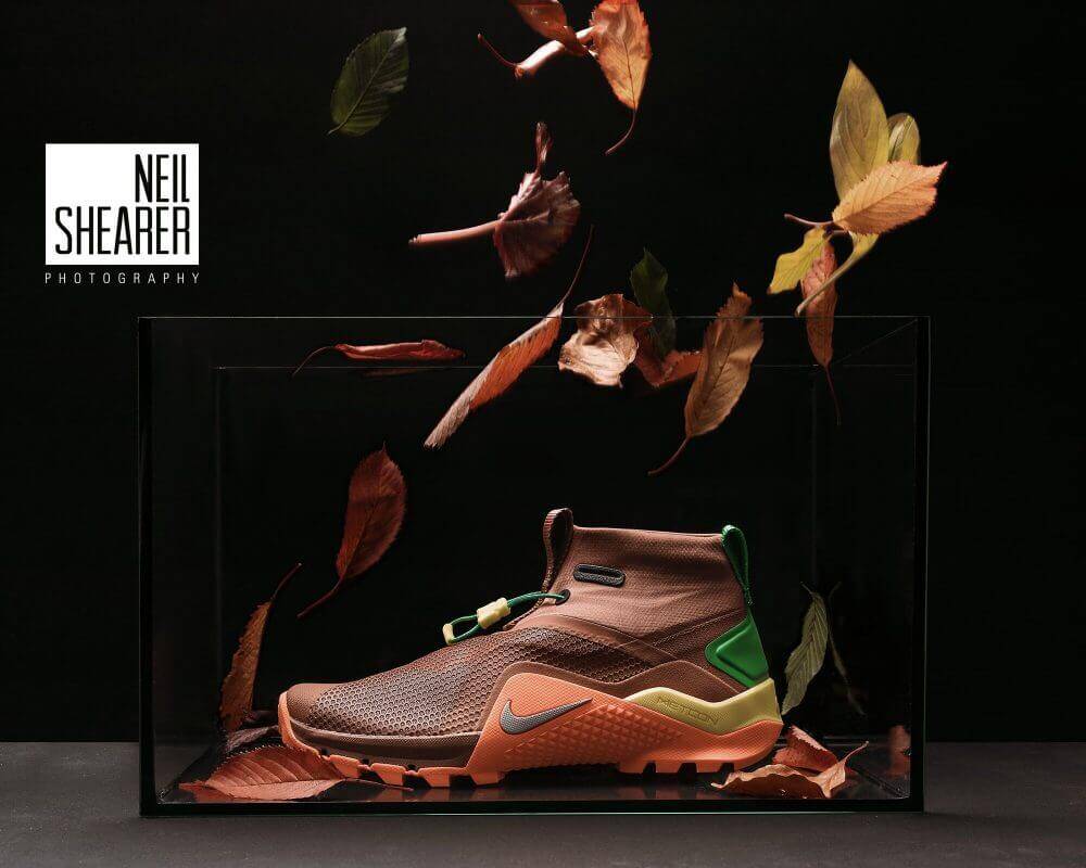
One of the best things about LinkedIn is the abundance of talented people there are to discover. Neil Shearer is a photographer who developed a series for the Nike Metcon SF (he took on the creation of this project to enhance his portfolio). The pictures were so striking that it interrupted another post I was writing on Merrell. Then I realized why it disrupted my discussion. I was writing about Merrell’s incredible documentary on Will ‘Akuna’ Robinson. In that post I also wrote about the poor job of product photography on the site:
In that article I stated that, “I used the photo of the Merrell Ashford Mid Canvas (above) which is flat and not very exciting. I realize that most product photography happens on a white background, but the customer visiting for the first time doesn’t need to see an Amazon image only. They need to know that Merrell products are more than just hiking shoes and can easily convert to lifestyle.”
My goal in discussing imagery is two fold, Merrell needs better photography, and retail brick and mortar has lost the love for merchandising. Walking into most stores now, the design/layout of the building isn’t very engaging and the layout of the footwear and apparel is a matter of how many shoes can we get on the wall. This has created an apathetic customer who doesn’t see sneaker stores as the art galleries that they are.
Sneakers became prominent in fashion for their ability to create individuality and style via footwear. When you think about the multiple sets of shoestrings you purchased as a kid to give your only pair of kicks more flavor, you are thinking about your work as an artist. Sneaker stores used to be covered in posters and images that attracted the eye and inspired imagination. Today, everything in the store is created to sell something and there isn’t any connection.
I don’t love my local sneaker shop and I have no desire to sit down, drink a coffee(I don’t drink coffee, but you get it) and talk about kicks with the people who work there.
Online there is merchandising that should take place as well, but every site has been duped into thinking the Amazon way is the perfect way to display all shoes. Amazon requires a 1000 x 1000 pixel, white background without logos for their sellers. This creates a homogeneous, lifeless product page. Brands have carried this photography method over and I get it. A flat white background allows the product to appear as one seamless scroll. It’s the same reason in stores the wall is simply covered with shoes or propped up on tables. It’s simple merchandising.
The problem is people are not responding to the physical or digital stores of brands because there isn’t any love in the layouts. I just realized I sound pretty artsy, but I really do love the visual aspect of a beautiful store or product website… and so does everyone else even if they don’t know it. A product shouldn’t look like a product when you’re trying to introduce it.
In the photos above Neil’s goal was:
I saw the new Metcon SF being marketed as a shoe for all weather, better grip and with a gaiter and then imagined how I would market it and show its versatility. That’s when I came up with the seasons concept. I wanted to create each of the seasons in a closed environment so the fish tank worked well in providing a level of consistency across the images.
Now imagine your favorite brand’s latest waterproof shoe (Merrell’s Thermo Snowdrift) in the same setup as the lead image on the product page. I know it’s hard to recreate this in a store, but this picture as a backdrop to a sales display would be dope asf. You can find more images from Neil at the links below this picture.

Instagram: www.instagram.com/neilshearer_photography
www.instagram.com/projectboozeandshoes
Facebook: www.facebook.com/Neilshearerphotography
Twitter: www.twitter.com/neildshearer
Website: https://www.neilshearerphotography.com

