![]()
Source: ADIDAS ORIGINALS DEERUPT
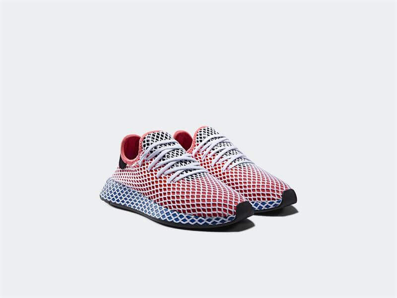
First, adidas has a delivery date of March 22nd. This shoe has been on the wall in Foot Locker stores for almost a month. The shoe didn’t have a launch date so the stores placed them on the shelves once they arrived. I state this to say that I’ve seen the shoe and held the shoe. I was going to do a video in store, but there were a lot of people so I would have had to yell. The model has its own dedicated page on the adidas site. It has a campaign styled by Haley Wollens, Tom Guinness and Emileh Kareh; this is obviously a shoe meant for fashion and not performance. Which makes sense. We are in a moment where smaller companies have a gateway in competing with larger brands. People are going for style over performance. The Deerupt was built from the catalog of adidas design. In it you can immediately see the ‘caged’ midsole of a number of 90s ZX models. The crosshatched design is meant to provide stability. In a fashion shoe the design is meant to create lines and curves from a variety of angles.

What is interesting here is the lack of branding, but the immediate recognition that this is adidas. That is both a good and a bad thing. The silhouette has been used by adidas over the last year and half and because of this the shoe feels familiar. When I saw it, I thought it was a modified Tennis Hu. Unfortunate for adidas I look at a lot of shoes so I also immediately saw the Puma Netfit system. I really like Tsugi’s from Puma although they have yet to catch on, it was a bold design element that was both playful and functional. On this model for adidas it just seems redundant. When I saw the shoe I thought, “That’s interesting.” I didn’t think, “Damn, that’s dope.” I saw it and immediately went back to this article:
That’s not a good thing. This is a first thought post though, but it’s definitely influenced by my own bias in what appears to be a lack of creativity by the Three Stripes. I’ve seen this shoe shape so much that it distracts. As simple as the Deerupt is, as bold as the lines are, I was not excited. That was until I saw the white colorway. In art and in writing the saying carte blanche means that you are going to be able to start over with a “blank slate”. The all white version creates an illusion that works much better than it does with color behind the crosshatched lines. When adidas aligned with BASF to utilize BOOST I stated that it changed the design of footwear. The midsole became a canvas. The stretch grid webbing here creates shades of grey on an all white shoe. I can only imagine if adidas had released this version first the response in store would be different. Right now the store that has this shoe in stock hasn’t sold a single pair. I happen to think it has everything to do with the color of the initial release above.
My first thought on seeing these… At 85.00 dollars it would Deerupt the NMD. At 100.00 dollars and in the Solar Red/Bluebird colorway, simplicity doesn’t disrupt here, it lies dormant and doesn’t even give a bit of steam.
Note: The 360 degree view on the site: http://www.adidas.com/us/deerupt is far better than the accompanying videos. Last year the Deerupt would have utilized both fashion and narrative. Here the styling by their three choices is devoid of interest.


