
![]()
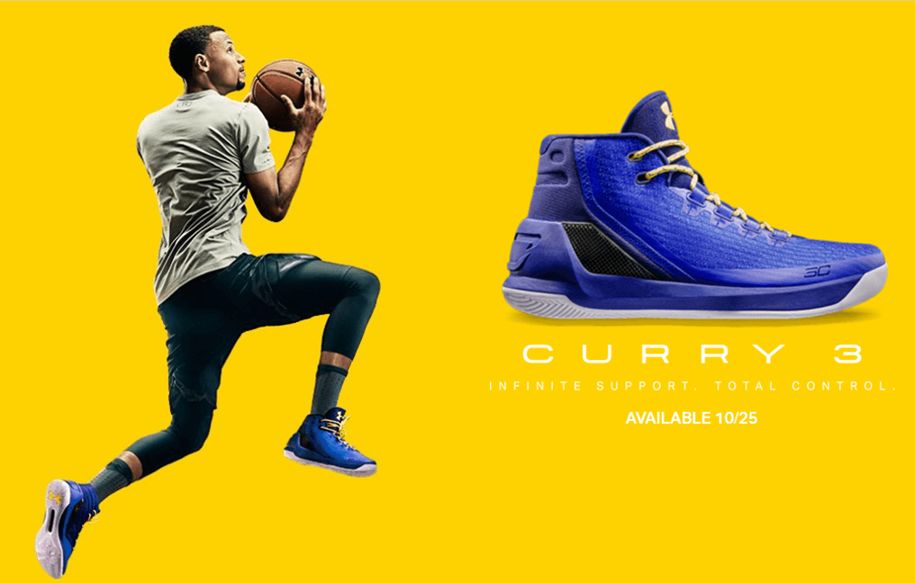
Shop Stephen Curry Shoes today. We just dropped the hottest basketball shoes from our Golden State hero. Check out Curry 3s and enjoy FREE SHIPPING available in US.
Source: Steph Curry 3 | Curry 3 Shoes Under Armour | US
My man Tayib at Housakicks and I have this crazy obsession with the Steph Curry line. It helps that we’ve both sold a lot of the SC1 and SC2 shoes, but something happened with the 2.5 and our fascination is starting to fade. We both hoped that the SC3/Curry 3 would make us forget about the 2.5 and it’s poor design… and now this. The elements of damn that ran through my head when I saw the shoe in Finish Line yesterday made the store manager ask me, “What’s wrong?” I just shook my head. Hoping to counter my obvious frustration I asked, “How much is this? You don’t have the price on it?” She immediately took the shoe and made sure to create the tag for it. I looked at the price and my reaction was a Florida Evans, “Damn, Damn, Damn!” So what are the 10 things wrong with the Curry 3?
-

Where is the logo? Upon first inspection of the shoe, the view that everyone will see when they walk up to the basketball wall at a Finish Line, or Footlocker, the designers took too much info from the people who have been saying remove the UA logo. Stupid ass mistake. If you are on the court the only identifiable mark on this shoe is on the tongue. Marketing 101, I need to know this is from the damn brand!!!!! People are wrong as hell. The Curry 1 and 2 both sold very well and they were eye catching because of the bold placement of the logo. The heel logo let you know immediately this was an UA product. That’s marketing.! The brand literally designed a shoe that doesn’t allow for the placement of the brand identifier on the most visible portion of the shoe. I know the logo is on the tongue, but that is honestly where the SC logo should be. That’s how PEs work. (Update- I realize the Air Jordan line has models that don’t have the Nike logo or Jordan logo on the side of the shoe, but those shoes are established. Under Armour is still branding the company and maybe they can get away with this… I just think the logo is really important.)
- “Infinite Support-Total Control” What the F–k does this mean? What the hell is infinite support? Here you have the greatest shooter the game has seen on the premier team in the NBA and all you could come up with is, Infinite Support-Total Control? A quick glance at Nike and its Kevin Durant slogan “Unlimited Moves” speaks directly to KD’s offensive prowess. Maybe someone thought they were being clever with Infinite as a similar word to Unlimited, but that slogan is shit. I know this one isn’t about the shoe, but it just rubs me the wrong way.
-
anafoam That Anafoam Medial that was used on the 2.5 was ugly as hell and honestly it makes the upper appear bulky although it’s not a heavy material. I understand that using different materials breaks up the lines of the shoe, but this is a material that doesn’t allow for any creativity in design. (Update: The Anafoam can be printed on but the colors are not very vivid when printed) You can’t print it and like I said, the 2.5 was not a great addition to the line. When you consider the Curry 1 and 2 sold out pretty much everywhere and the fact that every store has been RTV’ing the Curry 2.5… why would you retain any elements of that shoe? Because of the performance? If that’s the case then utilize the structure and material from the Curry 2. You used a fused construction before with a lightweight nubuck go back and do it again. It worked and it looked better. Anafoam looks cheap (It worked on the one because to me the cut of the shoe was better and more symmetrical which leads me to the next point.).
- Threadborne, the new woven material that is used on the upper isn’t a bad fabric. It’s just as capable of performance as Primeknit or Flyknit, but that name sucks. I could be more articulate, but Threadborne? More important, that woven material forces the toebox of the shoe to lack definition. This is okay if you look at a shoe like the Kyrie 2 because the design is broken up by a midfoot strap. Here, you have a bulky back end obviously for stability and a sleek front end. It’s like a muscle car with fat rear tires and knobby slicks on the front. Yeah it’s aerodynamic and sleek, but a basketball shoe has to have an element of symmetry and balance.
- Which leads me to the next point: symmetry. When someone says the most beautiful basketball shoe is? I wouldn’t hesitate to say the Air Jordan 11. There is a reason that shoe is considered perfect, symmetry. The Curry 3 is unbalanced. A simple solution for the design to be improved would be to break up the toebox. Instead of using the fused structure of the shoe, they should have gone traditional and implemented a suede or leather toe. Think of the Lebron 6. They used material that sat right above the instep and connected the left side of the toebox to the right side. This one change would have changed the look of this shoe and actually made it more casual friendly. Unfortunately the bulkiness of the heel makes the shoe awkward. Note the picture to the left. This one addition breaks up the toebox.
-
Air Jordan 22, look familiar? The shoe looks eerily familiar and it’s not a good thing. Sometimes design inspiration is completely accidental. When you accidentally implement elements of one of the worst Jordan designs, it’s not a good thing. I really want to love the Curry 3 because I like the player. This shoe makes it hard on so many levels and it appears to be a step backwards.
- Nike dropped the price of the KD 9 from 180-150 and created a better looking shoe. They also have the Kyrie a shoe very similar to the Curry line priced at 120. The 130 dollar pricepoint of the Curry 1, 2 and 2.5 was not bad and it placed it among the most affordable performance shoe out there. The title for the best basketball performance shoe by price goes the adidas Lilliard line. When the manager added that tag to the shoe, that’s what really gave me my WTF? moment. 140.00? Really UA? You add Threadborne and Carbon Fiber on a shoe and decrease the actual branding and you move the price up to 140? I get it. The carbon fiber is the reason and the Threadborne, but you are now asking people to buy solely into Curry. I get that a lot of people are going to love the “I Can Do All Things” on the heel, but for a similar price 150, Warriors fans can support KD and wear a shoe that actually can be rocked off the court. I think this 10 dollar bump is a mistake.
- The marketing. When you look at the picture at the top of this page, you can’t see a single Under Armour logo on Curry. It’s barely noticeable on the tongue and sole of the shoe. I know we are on the site, but outside of the site, the branding on this shoe is being done by influencers. On YouTube the majority of the videos in search are from people who got pairs early and are doing reviews. On UA’s own YouTube they only have a Threadborne video. There isn’t any hype being sold by the brand on this release. Nothing classic or flashy. I get that isn’t Steph’s way, but a journey through the Bay Area would have endeared me to both Steph and some connection to a slogan that established that the Warriors are still Steph’s team would be great. I mean picture Steph jogging and working on his ball handling in UAS gear (cross promotion) through the streets of San Francisco with people nodding and the final words “It’s Still On You”. Now the bulky, sturdy shape implies that Steph has to carry the weight no matter the perception of the superteam. There isn’t one video that makes me feel anything on the Curry 3 homepage. There isn’t any emotional connection and that’s unfortunate for such a good guy. What’s worse, the homepage header banner is being shared with the SWACKET… the freaking Swacket?
- The colorways are too basic. Because of the use of Threadborne maybe there isn’t a lot of diversity, but there are 8 colors on the homepage of the UA site. Not a single one stands out in any way. Had the shoes remained at the 130 pricepoint. They could have introduced a Lux Line (which debut last year at 140-160) with more vibrant colors and prints on the upper. As it stands there isn’t a single pair dropping with a translucent outsole. That’s not a good thing.
- A lack of creativity in the creation of the shoe. if you are going to increase pricing to 140, there needed to be something unique about this release. While it would cut into profits, do what I do. When I made the CG097III I included in every pair a matching pair of ARCH socks. In the marketing picture, and on the site there isn’t even an upsell for the shoes. Actually on the website the shoe isn’t dropping until 10-25… the shoe is already out at stores!!!!! If Under Armour went back to its roots, they would make the perfect basketball sock. They made the perfect workout shirt, so socks would have been a natural progression and placing that sock for free in the the box of every drop, may have been an expense, but it would show a level of thoughtfulness that would endear brand loyalists and new buyers. More important a dope pair of socks featured with the shoe would break up the lines and colors of the shoes. The creativity feels absent here.
Overall, I don’t feel that the Curry 3 will be as solid in sales as the 1 and 2. I think the brand has taken a step back and this needs to be corrected asap. What do you think?
Update: 10-24-2016 – Under Armour is officially dropping the shoe and they are featuring this video. I actually think it’s a very good promo item. Will it change the narrative and make this shoe a bit more desired? Yes, if they continue to push the story and drop more videos. No, if they think this initial video will do well without pushing more of this #makethatold… I still think my It’s Still On Me slogan is better.