![]()
Originally posted on Housakicks
I’m really enjoying Nike’s NBA takeover so far; in the space of two days Nike has already unleashed a fury of exciting news. First it was the Nike NBA Connected Jerseys and now the NBA Statement Edition Uniforms. The brand is definitely a marketing genius and must be given a lot of props for that. Chris from ARCH talked about the fact that Nike needed to be less polished and more rugged in their campaigns and this is exactly what was done with the Statement Jerseys, and it’s exciting. According to Nike,
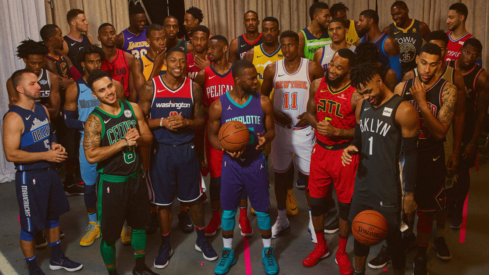
The Statement Edition uniform sets the tone for big games or rivalries and is inspired by the team’s desire to make a bold statement every time they step on the court. For each team, the aesthetic expresses the specific spirit of the current roster.
For example, teams such as Boston, Chicago and Cleveland chose black bases — to convey a sense of strength and power — for their Statement Edition look. Each has team-specific detailing; Chicago’s pays homage to its historic use of pinstripes, while Cleveland’s displays the franchise’s secondary logo. The latter conceit also follows in Milwaukee’s Statement Edition uniform, where the team’s powerful new Buck logo is front and center. Meanwhile, plays on heritage are evident in Denver (where the city’s famous mile-high altitude is viewed as an advantage) and Philadelphia (where the team’s Sixers script is emblazoned in white).
Perhaps the strongest declaration is made by the champs, the Golden State Warriors, as the franchise pays respect to the culture and legacy of its hometown: Oakland. Flipping an iconic graphic, the Warriors Statement Edition uniform reads “The Town” above a new team crest, which employs Oakland’s family Oaktree (a design found on street signs and sourced by the team through Oakland’s city government).

This is a brilliant idea and the way each jersey was presented individually was also very raw. If you look at the pictures above and below, most players are not really pausing for the pictures. The background of the picture says it all- unorganized basement with tools all over the places and you see the players just being themselves in the picture. This is great and personable and kudos for Nike for that. I sense that this NBA takeover will undoubtedly breathe some life into Nike basketball; I’m glad the brand is staying in its lane ( performance/sport) but is able to incorporate raw elements from every day life to connect with the average Joe.


For more player pictures visit Nike

