![]()
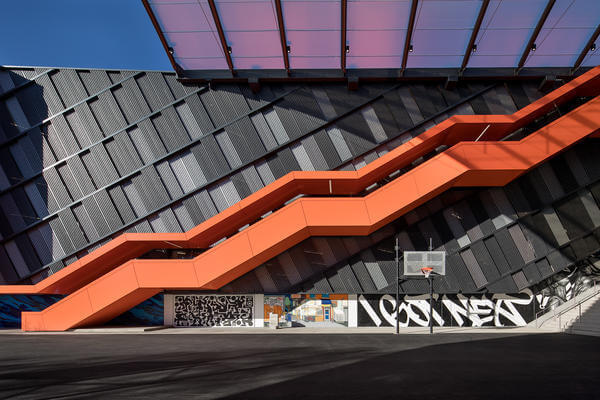
Opening on January 4 at WHQ, the structure is home to some of the brand’s most exciting artwork.
Source: Stash and More Paint Murals for Nike’s New NYC Garage
Last year I spent as much time writing about the endeavors of adidas in the art community as I did writing about their footwear. The Three Stripes subtle attention to detail endeared the brand to the new locations they built stores in. This isn’t about adidas though, it’s about the Swoosh and how the brand just created a connective tissue that is one part tourist attraction, one part sports center and one part functional design. The three elements make one of the dopest parking garages in the US.
Let’s be real… who gives a damn about parking? Everyone! especially when you’re on the way to work or a night on the town in the city. Parking lots however are often lost architectural structures. They are cold, rough, places where you experience the heartache of having your new car get a ding or your blood pressure rises because no one is every paying attention. The garage isn’t a place you really want to spend any time and because of this these spaces are often overlooked.
What Nike has done here is to make the parking structure a work of art. It’s an attention to detail that shows a level of respect for the city and connects the people in the area to the location via functionality. Not only does the structure look great, you can take advantage of the structure through sport.
1. Six parking levels. Each one celebrates one of New York City’s professional sports franchises.
2. Basketball, futsal and handball courts. These fill the massive central courtyard. Facing west inside the NYC Garage courtyard
3. Seventeen brilliant murals. International artists Stash, SP One, CHINO BYI, FAUST, Grotesk, Felipe Pantone, GOREY, DAIM, Tones One, Gary Stranger, Yoon Hyup, SPETO, Claw Money, Nardstar*, Paola Delfin, Hueman and Ashley Montague represent 10 countries and serve to highlight the global reach of one of New York’s great cultural exports: graffiti.
I could go on and on about this, but the detail in the works of art (all with an obvious connection to the Swoosh) capture every element of what art has become. Art is functional and in that function there lies beauty. Nike’s commission is definitely a marketing tactic, but it’s incredible especially when you look at the larger pictures on the site and begin to analyze each one. The artwork is mostly inspired by classic Nike icons with a nod to the history and the future of the brand; from Pre to Kyrie, to design elements on Jordans to women’s graffiti artists and designers, the diverse creative collection is amazing. Use the source link to see the pictures.

