![]()
Source: Puma x Trapstar – SS17 | Hanon
Puma is having an incredible year, but let’s be honest that year hasn’t had anything to do with the signing of the Weeknd or the recent deal with Big Sean.
Dudes aren’t rocking Puma, women are. In an attempt to attract the same level of fanaticism that has women rocking classic Puma Clyde and Fenty from Rihanna, Puma links with London based Trapstar to drop a military inspired set of streetwear. The result is dope, but I have to ask the question, will this be the move that makes Puma an attractive option for guys?
Puma never really capitalized on Usain Bolt and his Jamaican Heritage. Here in the Trapstar collection the Yardy influence is evident. The green, black and red aren’t subtle by any means and the rudeboy ethos of being combat ready is there, but Puma is missing an element of cool for guys that Trapstar may not be able to capture for them. If this was purely a Trapstar collection without the gigantic splashes of the Puma logo generously applied, if they had instead used the smaller Puma patch logo from the tongue of the footwear, the more understated branding would have been a better approach.
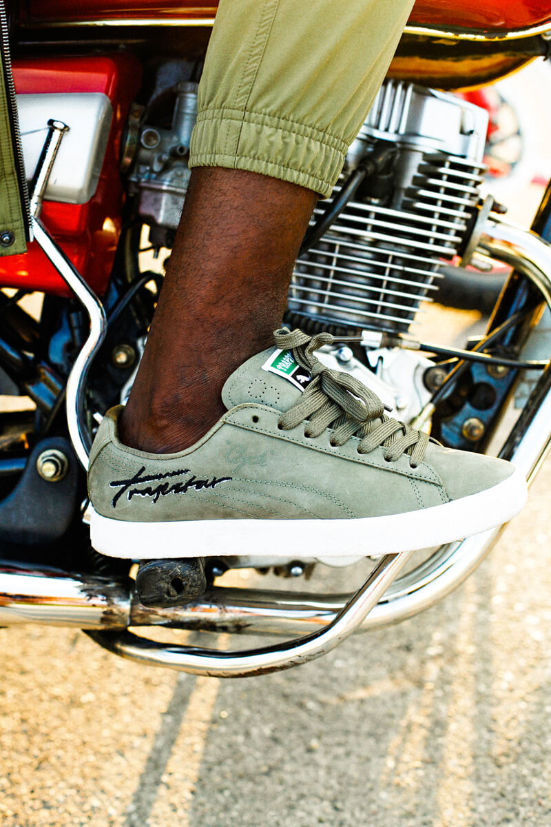
In this picture with the motorcycle the logos aren’t as bold and the styling is immediately better. It doesn’t feel forced. Puma has to grab a share of the men’s market in order to sustain. I said last year that Puma wouldn’t continue to grow and I based it on the shifting fashion sense of women, but I didn’t realize that Ri Ri could literally carry a brand. I now state that Rihanna is going to create an abundance of interest which will generate an increase in the manufacturing of product, that will see stores who carry Fenty moving the product slower. Nike’s introduction of plus size will chip into the fashion driven Puma slightly and growth will have to take place on the men’s side.
Puma simply hasn’t figured this side out yet and this Trapstar collab won’t do the job. Will it find footing in the UK, definitely, but I don’t know if it is the right move and I’m basing this solely on the fact that the logo in this collection is overstated and using the tongue logo would have actually been a better move. What do you think? Use the source link to check out more of the pictures in the collection.


