![]()
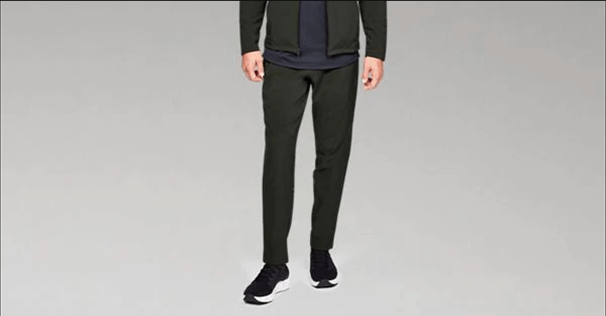
Shop Under Armour for Men’s UA Storm Cyclone Pants in our Men’s Pants department. All men’s pants are eligible for FREE SHIPPING in the USA.
Source: Men’s UA Storm Cyclone Pants | Under Armour US
I’m using the picture at the lead to establish one thing, Under Armour is white asf. Yep, I said it and I would apologize, but this needed to be said. I love Steph, but from the outside looking in and from listening to those on the inside who walked out, it’s obvious UA has the same problem as adidas and other brands chasing Nike, they lack dope ass people sitting in their offices. Which isn’t to imply all Black people are dope. We would willingly trade a number of people who I won’t name. Back to the picture above, this is bad marketing. This is the brand’s website.
- You can’t see the shoes
- The color of the shirt is muted which dulls the impact of the pants
- The black shoes with olive pants creates one big ass pantsboots look
- The dull grey background may be standard for product shoots, but is uninspiring and lacks real life
- We can’t see dude in the picture which is okay, but his hands are being held like he’s about to do a gunslinger’s draw
This isn’t any disrespect to people who are there. I don’t know them and they don’t know me and it’s easy for me to write this as an independent consultant who can pick and choose what I want to look at, but I chose that picture at the lead for a reason:
That’s a flat butt, white ass picture up there. Which isn’t to say there aren’t any fly white people:

Kid in the picture above is styled perfectly and he happens to be white! Look at that. I can pull any number of images from indie retail outlets and those images they present include a diverse range of shades and sizes and every picture sells me even in their static format.
Dope S–t I Like: UAS Modern American Sportswear | I May Be Wrong
A few years ago Under Armour launched UAS and I had a double take. The gear wasn’t bad at all, but the marketing and photography was not very good. None of the project was done correctly and because of this UAS felt unnatural and out of place. It was wiped out and the brand integrated it into what is now called Sportstyle… which is not good either, but has a number of well-designed shoes and clothes, but because Under Armour has one of the worst website layouts for a billion dollar sports company, you can’t tell what anything really looks like.
Under Armour should bring back UAS. I happen to think it would work and I think it would provide the brand with a completely different opportunity. If they don’t quality products like the Payload Button Down will get lost in the shuffle. I will get lost because the brand simply doesn’t know how to style. Button the damn shirt to the top and take the UAS logo and replace the shield. Nike has BRS, the Nike and Swoosh logo and adidas has three different logos. There isn’t anything, anything at all wrong with the UAS logo. I’m available for consults, just let me change the apparel to the way it should look and we’re good:


