
![]()
Under Armour’s Anatomix Spawn 2 is Fast, Flexible and Supportive
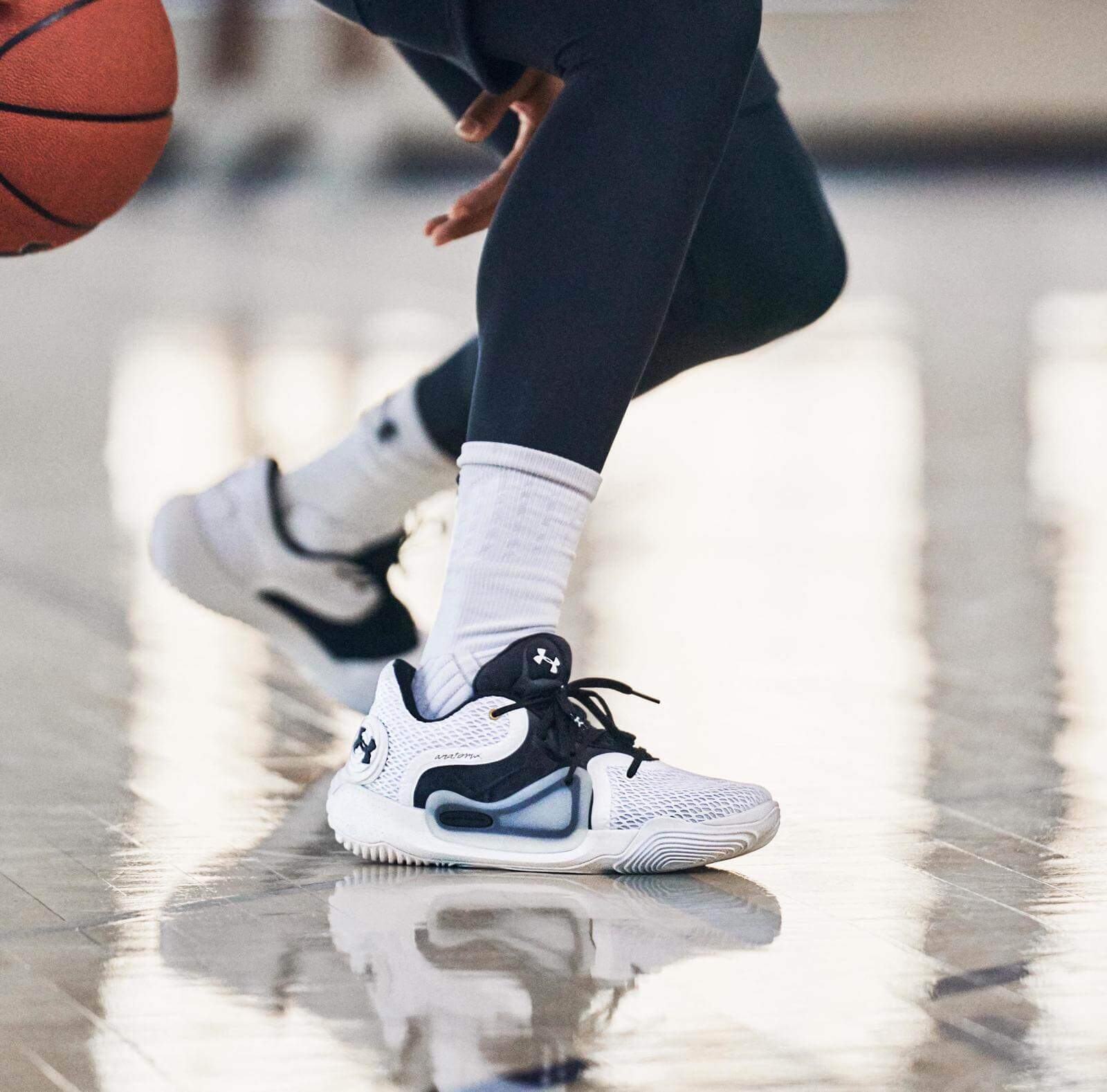
Source: UA Anatomix Spawn 2
Curry wore the original Spawn so the shoe has a legit history in the NBA. The return of the shoe in its second version arrived without fanfare or celebration. It was a simple, straightforward delivery with Dennis Smith Jr. as the man behind the wheel. The shoe looks incredible and is on trend, but what is the most appealing aspect is the Direct to Consumer pricing. This is a men’s model that only rings up at 100.00 dollars. This was the same price it rang up at 6 years ago. I could dive into the how and why Under Armour has created an incredible opportunity for access to the consumer, but I’ve repeated that continuously. What I’ll do this time is show you the images utilized in the release for the pair and then explain why the PR team needs to merge with the copy team to deliver Under Armour a new basketball e-commerce strategy.

- Targeted Support: Anatomix upper eliminates slippage for more precise movements.
- Natural Flex: Built around the anatomy of the foot so the shoe moves with your foot, not against it.
- Faster Response: Micro G™ cushioning is light and incredibly responsive for quicker moves.
- Weight: 12.5 oz.
Micro G is a proven performance cushion. The shoe looks great and the one consistent issue with UA is the logo’s intrusion into the design of the shoe. On the Spawn 2 the company has shifted the logo, which remains prominent, to the lateral heel providing branding and function as the shoe is primarily a knit and mesh blend with synthetic overlays for stability. The logo arrives on the heel counter and compliments the design. The lateral sidewall appears to be a TPU that recreates the original shifting Spawn design elements. That same TPU functions as a heel cup for a lockdown fit.
Merchandising Happens in eCommerce Also
The consistent issue for most retail outlets and brands is the idea that the consumer can’t be distracted from the product. In my Problems in Retail class at UT Austin this semester I explained to my students that the primary issue with websites is that they have all applied an Amazon aesthetic to their sites. 1000 x 1000 pixels with a white background is the norm. That is fine for the initial product shot. Under Armour is not Nike so their site can’t revolve around old norms. Even Nike has introduce gifs into their product pages and they have chosen an off-white background to break up the layout of the page. Under Armour’s PR team utilizes clear description with active imagery, but that design element doesn’t lead on the product page on Under Armour. The description and imagery is at the footer. I get this, but I think it should be switched. I get that a visitor to the site should have immediate access to purchase, but the customer has been trained to scroll. A dynamic image at the head on the product page is engaging.
I under-stand (see what I did there?) that performance under-scores (I did it again, lol) everything Under-Armour (I’m on a roll)… okay post break.
Under Armour has gotten away from their Underdog mentality and the company is suffering because of it. The utilization of “Under” is an opportunity for tee shirts posters, street teams, gifs, a virtual grassroots approach to marketing is available to the brand that operates under the surface of the system. I just needed to throw that in there.
I’m making an active call to smaller retailers to upgrade their e-commerce with more lively product shots. I do understand that there is an ease in simply reproducing code for each page to create a standard. I’ve been in e-commerce for 15 years. What I’m calling for is a new standard. The consumer is bored. The same segmentation and funneling that happens in brick and mortar must become the norm on websites. Particularly for Under Armour as the brand is underperforming at retail. This is not a call for every picture to be an active product shot with Dennis Smith. That would contribute to a slower load time and every second is precious. I am stating that this copy that appears in the information for the Anatomix Spawn 2 should be on the product page and that the first picture should feature a UA athlete before the basic white background is utilized.
This is a small step, but would be an effective one. The Spawn 2 drops January 1, 2020.
Right here is where I would usually add the link to the product page, but as good as the PR team has been, their e-commerce guys haven’t built the page yet… What I will do is leave the page for the Spawn Low which is currently on sale and it features Joel Embiid… at the bottom of the page, smh 😉
https://www.underarmour.com/en-us/mens-ua-anatomix-spawn-low-basketball-shoes/pcid3021263-001